


We’ve Got Your Message!
Thanks for reaching out! Your project details have been received and our team is already reviewing them.
What Happens Next?
Within 2 Hours
Our UX strategist checks your website requirements and learns about your industry.
Within 24 Hours
You’ll receive a proposal with pricing and a clear project plan.
Within 48 Hours
We’ll schedule a call to go over your goals and technical needs.
Day 10
Your website goes LIVE! Fully responsive and ready to bring results
While You Wait…
Look out for our confirmation email and proposal in your inbox.
Gather your goals and ideas, it sets the stage for a strong start.
Keep a slot open for a quick call when we reach out.
What You’re Getting
UX-led design that turns visitors into clients
10-day delivery (no long waits)
Industry-focused expertise
Mobile-first responsive design
Easy updates without needing a developer
Many entrepreneurs have launched their dream websites with Brackets Agency. You’re next
Get in Touch
Email - moksha@brackets.agency
160 Robinson Road, #14-04 Singapore Business Federation Center
Singapore (068914)
Singapore (068914)
Portfolio Management Tool - From Confusion to Clarity
We helped redesign a complex portfolio management tool into a streamlined, intuitive platform that product teams want to use.
Industry
Productivity, Product Management
Product
Web Dashboard
Services
UX Audit
UX Design
Design System
Visual System
.jpg)
The MVP had good bones but fell short where it mattered most: usability.
This was more than a cosmetic problem — it was directly impacting user trust and adoption.
There was no clear guide for users navigating the tool
Flows were often dead ends — users couldn’t complete key actions
The visual hierarchy was inconsistent and cluttered
Same action, different patterns — there was no design consistency
Overall, UX created cognitive overload for already-busy teams
01 Strategy & Design Approach
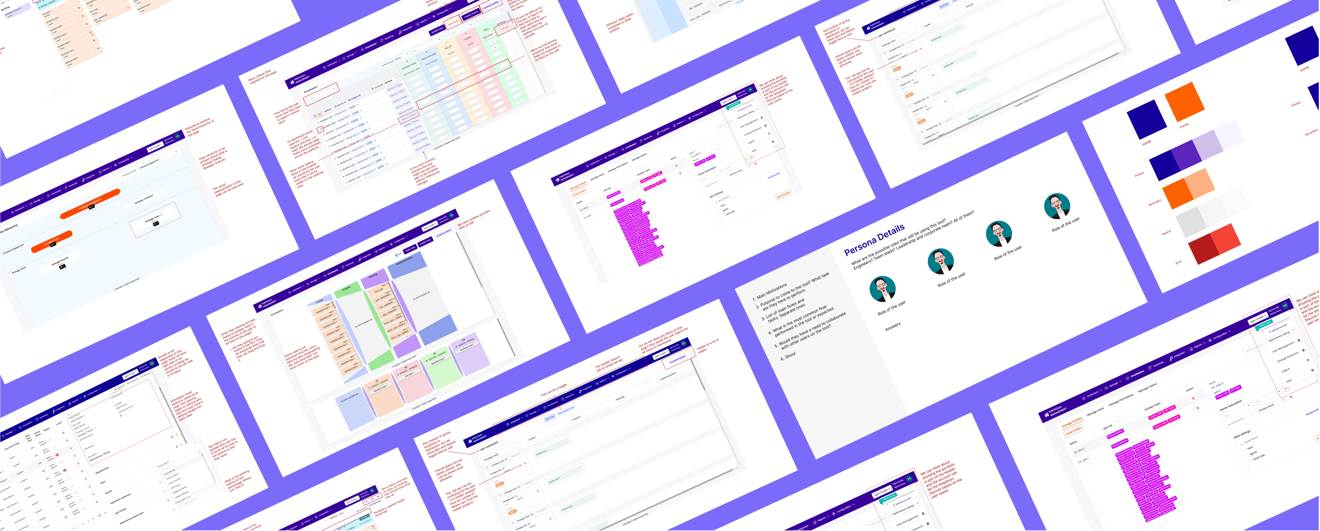
We started with a full product audit. Our team mapped out user journeys, documented inconsistencies, and pinpointed where the tool broke down in real-world use.
Here’s how we approached it:
• Ran a detailed UX audit to capture flow breakdowns and friction points
• Defined personas and usage goals to anchor every design decision
• Created a visual language that felt clean, modern, and trustworthy
• Built a scalable design system to standardize interactions and UI
• Reworked key workflows like dashboard views, roadmaps, and prioritization
This was about helping the product get out of the way.
.svg)
.svg)
About the client
This platform is used by leadership and product teams in mid-to-large companies to manage project roadmaps, prioritize work, and track outcomes. But despite its capabilities, the original version made even the simplest workflows feel like a maze.
.webp)
.svg)
The users? Product leads, managers, and execs who needed clarity, speed, and control, not more confusion.

02 Execution Highlights
The redesigned tool is now easier to learn, faster to navigate, and better aligned with how users think, not just how features were built.

UX Audit & Research
• Identified high-friction areas in user flows
• Captured inconsistent behaviors and missing feedback loops
• Mapped the usage intent of key user personas
• Identified high-friction areas in user flows
• Captured inconsistent behaviors and missing feedback loops
• Mapped the usage intent of key user personas

Design System & Visual Language
• Defined component libraries and visual patterns
• Established color standards, spacing rules, and icon systems
• Standardized interaction patterns across modules
• Defined component libraries and visual patterns
• Established color standards, spacing rules, and icon systems
• Standardized interaction patterns across modules
.svg)
UI & Interaction Design
• Built over 130 high-fidelity final screens
• Designed with layout clarity, max space usage, and user flexibility
• Simplified complex flows across dashboards, prioritization, and roadmaps
• Enabled drag-and-drop functionality for easy project tracking
• Built over 130 high-fidelity final screens
• Designed with layout clarity, max space usage, and user flexibility
• Simplified complex flows across dashboards, prioritization, and roadmaps
• Enabled drag-and-drop functionality for easy project tracking
Our goal was to create a captivating visual identity that truly embodies the essence of the brand, resulting in a distinctive and unforgettable theme.
03 Impact
• Clear, consistent interaction language is now used across the product.
• The redesigned tool is now easier to learn, faster to navigate, and better aligned with how users think, not just how features were built.
• We helped make a powerful tool feel effortless. One that aligns with how product teams work, not how systems are structured.
• The redesigned tool is now easier to learn, faster to navigate, and better aligned with how users think, not just how features were built.
• We helped make a powerful tool feel effortless. One that aligns with how product teams work, not how systems are structured.


Discover the flow
01 Discovery
.webp)
02 Ideation
03 Execution
300+ hours of combined research, design, and ideation
200+ exploratory wireframes were iterated on before the final design

130+ final UI screens across the tool
Significant reduction in user friction and cognitive load
Our focus was clarity, consistency, and confidence, and the result speaks for itself.
.avif)
.avif)
.avif)
.avif)
.svg)

.svg)


